Powerful tree graphics with ggplot2
Mon Mar 12 15:08:24 2018
This page demos already-constructed examples of phylogenetic trees created via the plot_tree function in the phyloseq package, which in-turn uses the powerful graphics package called ggplot2.
Load the package and datasets
library("phyloseq")
data("esophagus")
data("GlobalPatterns")
For completeness, here is the version number of phyloseq used to build this instance of the tutorial – and also how you can check your own current version from the command line.
packageVersion("phyloseq")## [1] '1.22.3'We will also use ggplot2 commands in at least one section, so we will load ggplot2 now as well.
library("ggplot2"); packageVersion("ggplot2")## [1] '2.2.1'Example
We want to plot trees, sometimes even bootstrap values, but notice that the node labels in the GlobalPatterns dataset are actually a bit strange. They look like they might be bootstrap values, but they sometimes have two decimals.
head(phy_tree(GlobalPatterns)$node.label, 10)## [1] "" "0.858.4" "1.000.154" "0.764.3" "0.995.2"
## [6] "1.000.2" "0.943.7" "0.971.6" "0.766" "0.611"Could systematically remove the second decimal, but why not just take the first 4 characters instead?
phy_tree(GlobalPatterns)$node.label = substr(phy_tree(GlobalPatterns)$node.label, 1, 4)Great, now that we’re more happy with the node labels at least looking like bootstrap values, we can move on to using these along with other information about data mapped onto the tree graphic.
The GlobalPatterns dataset has many OTUs, more than we would want to try to fit on a tree graphic
ntaxa(GlobalPatterns)## [1] 19216So, let’s arbitrarily prune to just the first 50 OTUs in GlobalPatterns, and store this as physeq, which also happens to be the name for most main data parameters of function in the phyloseq package.
physeq = prune_taxa(taxa_names(GlobalPatterns)[1:50], GlobalPatterns)Now let’s look at what happens with the default plot_tree settings.
plot_tree(physeq)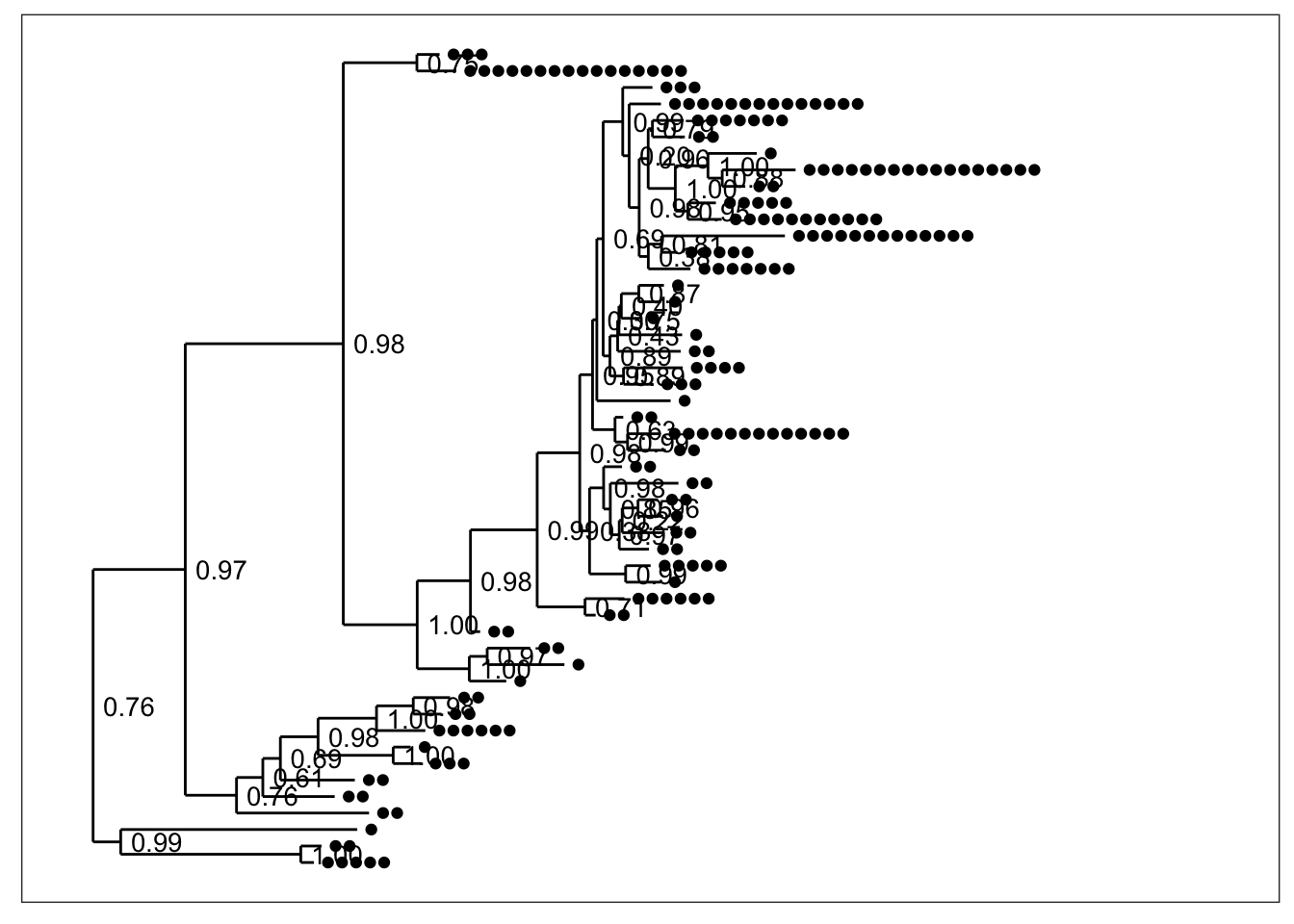 By default, black dots are annotated next to tips (OTUs) in the tree, one for each sample in which that OTU was observed. Some have more dots than others. Also by default, the node labels that were stored in the tree were added next to each node without any processing (although we had trimmed their length to 4 characters in the previous step).
What if we want to just see the tree with no sample points next to the tips?
plot_tree(physeq, "treeonly") And what about without the node labels either?
plot_tree(physeq, "treeonly", nodeplotblank)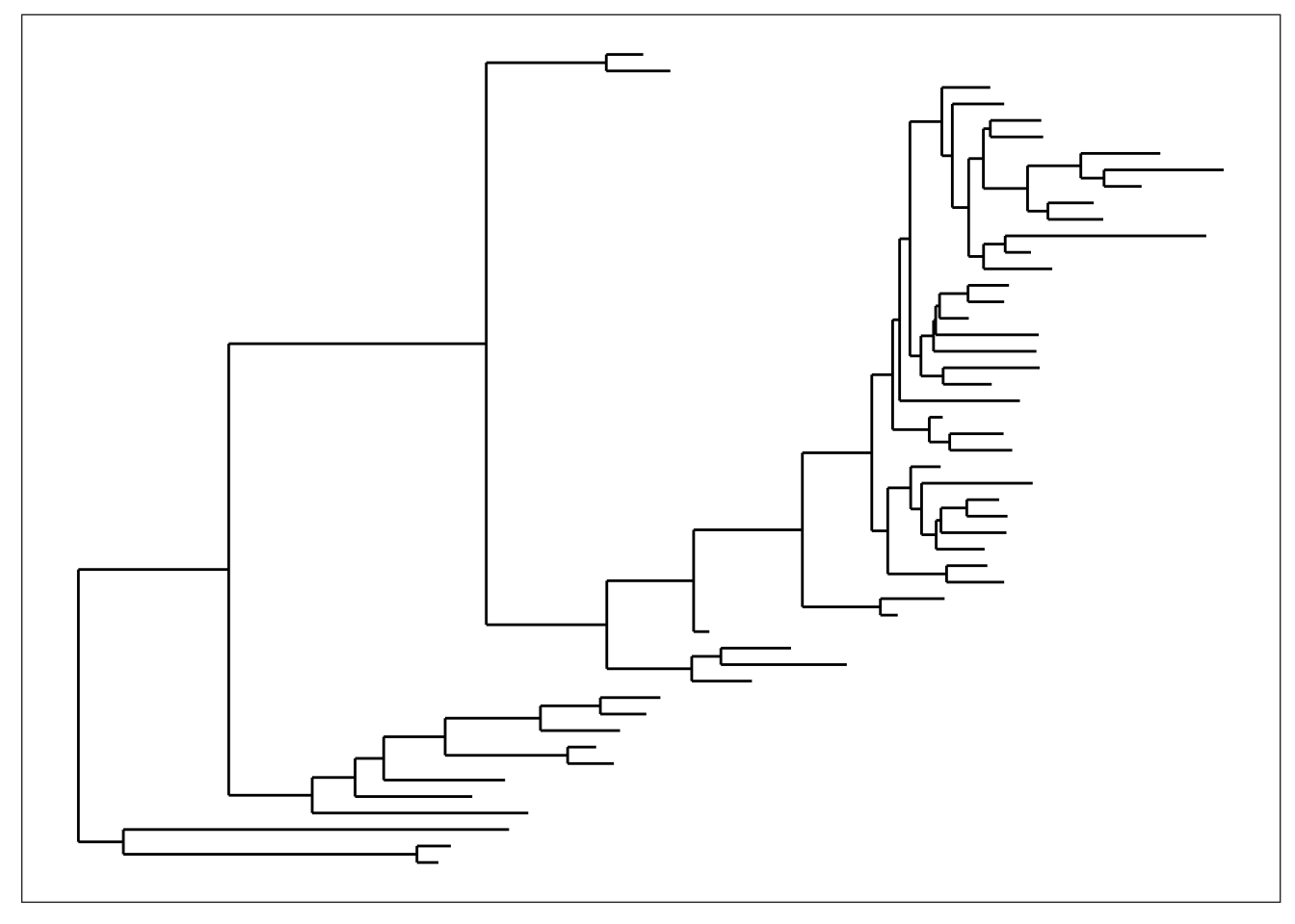 We can adjust the way branches are rotated to make it look nicer using the
 ladderize parameter.
plot_tree(physeq, "treeonly", nodeplotblank, ladderize="left")
plot_tree(physeq, "treeonly", nodeplotblank, ladderize=TRUE)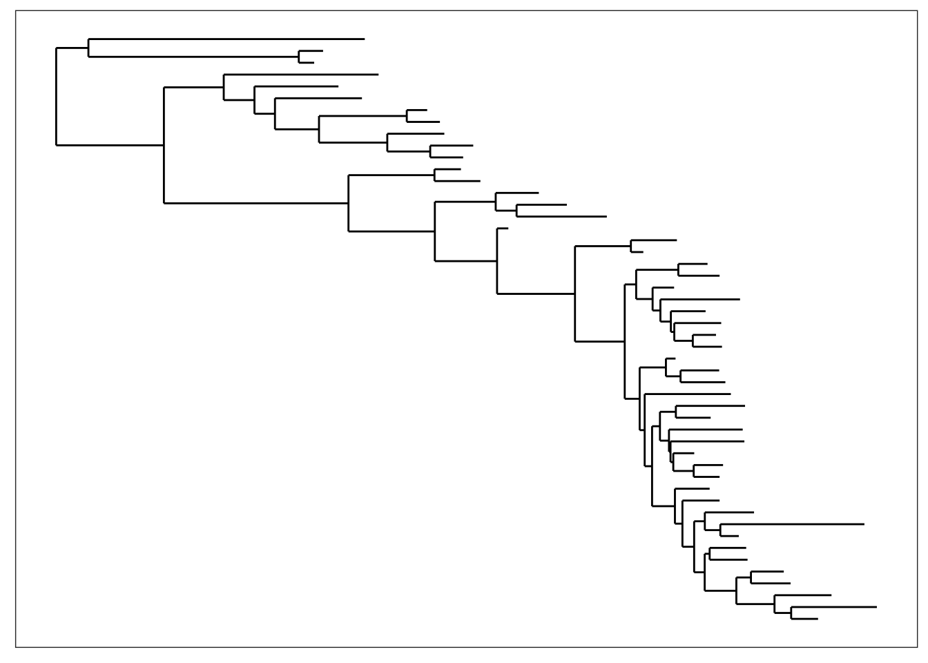 And what if we want to add the OTU labels next to each tip?
plot_tree(physeq, nodelabf=nodeplotblank, label.tips="taxa_names", ladderize="left")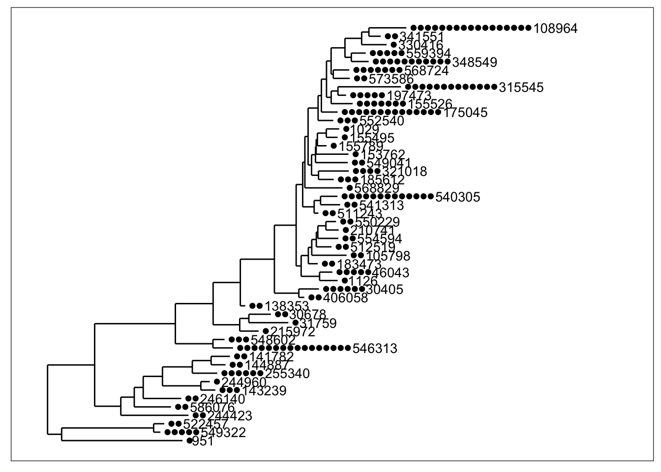
Any method parameter argument other than "sampledodge" (the default) will not add dodged sample points next to the tips.
plot_tree(physeq, "anythingelse")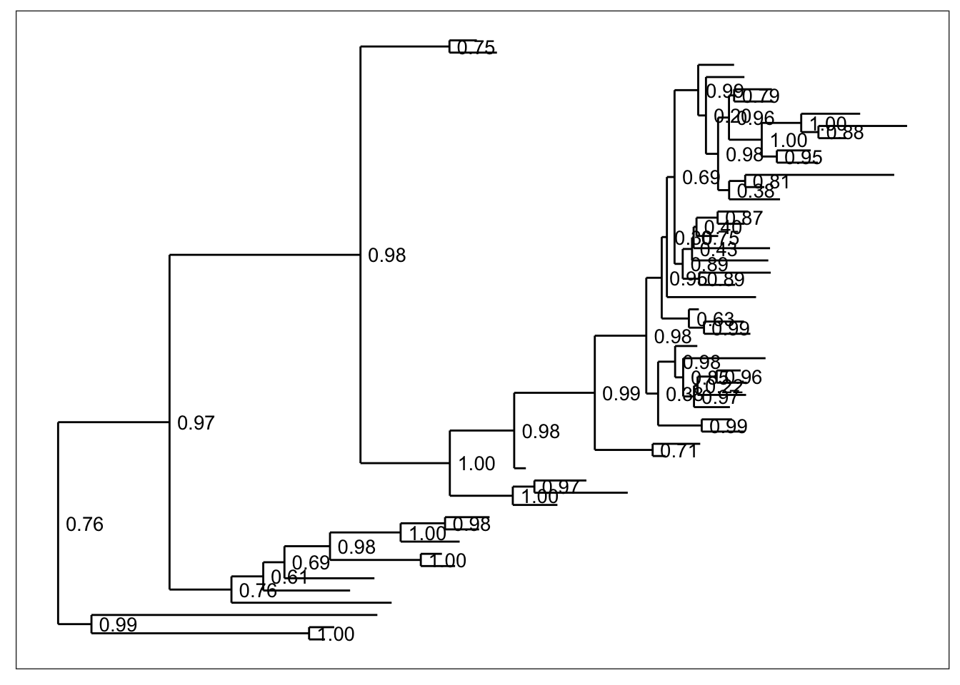
Mapping Variables in Data
In the default argument to method, "sampledodge", a point is added next to each OTU tip in the tree for every sample in which that OTU was observed. We can then map certain aesthetic features of these points to variables in our data.
Color
Color is one of the most useful aesthetics in tree graphics when they are complicated. Color can be mapped to either taxonomic ranks or sample covariates. For instance, we can map color to the type of sample collected (environmental location).
plot_tree(physeq, nodelabf=nodeplotboot(), ladderize="left", color="SampleType") and we can alternatively map color to taxonomic class.
plot_tree(physeq, nodelabf=nodeplotboot(), ladderize="left", color="Class")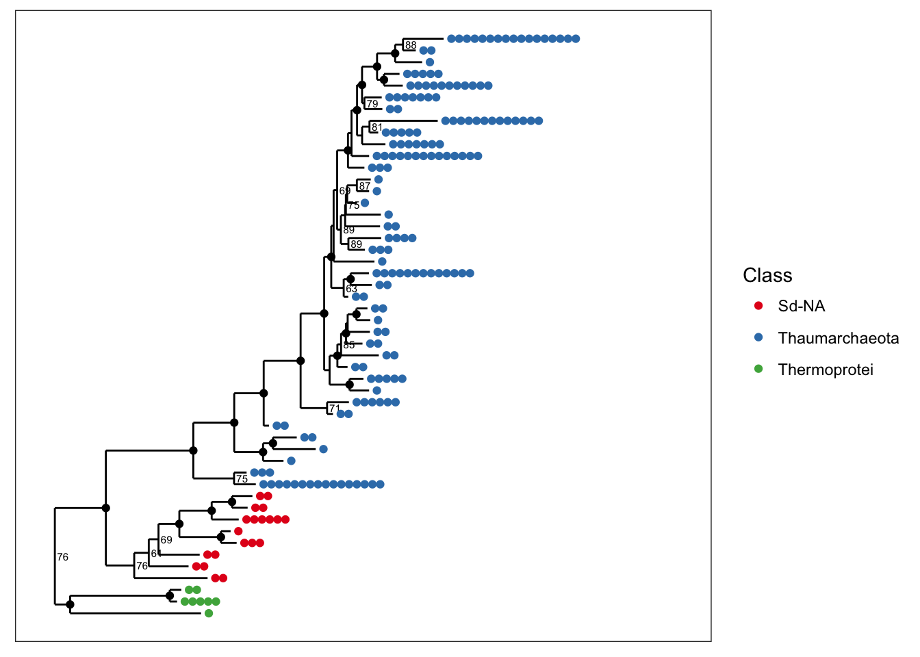
Shape
You can also map a variable to point shape if it has 6 or fewer categories, and this can be done even when color is also mapped. Here we map shape to taxonomic class so that we can still indicate it in the graphic while also mapping SampleType to point color.
plot_tree(physeq, nodelabf=nodeplotboot(), ladderize="left", color="SampleType", shape="Class")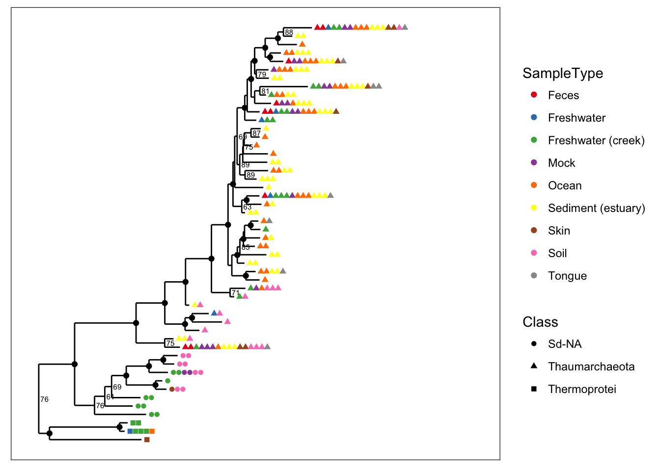
Node labels
One of the most common reasons to label nodes is to add confidence measures, often a bootstrap value, to the nodes of the tree. The following graphics show different ways of doing this (labels are added by default if present in your tree).
# The default
plot_tree(physeq, color="SampleType", ladderize="left")
# Special bootstrap label
plot_tree(physeq, nodelabf=nodeplotboot(), color="SampleType", ladderize="left")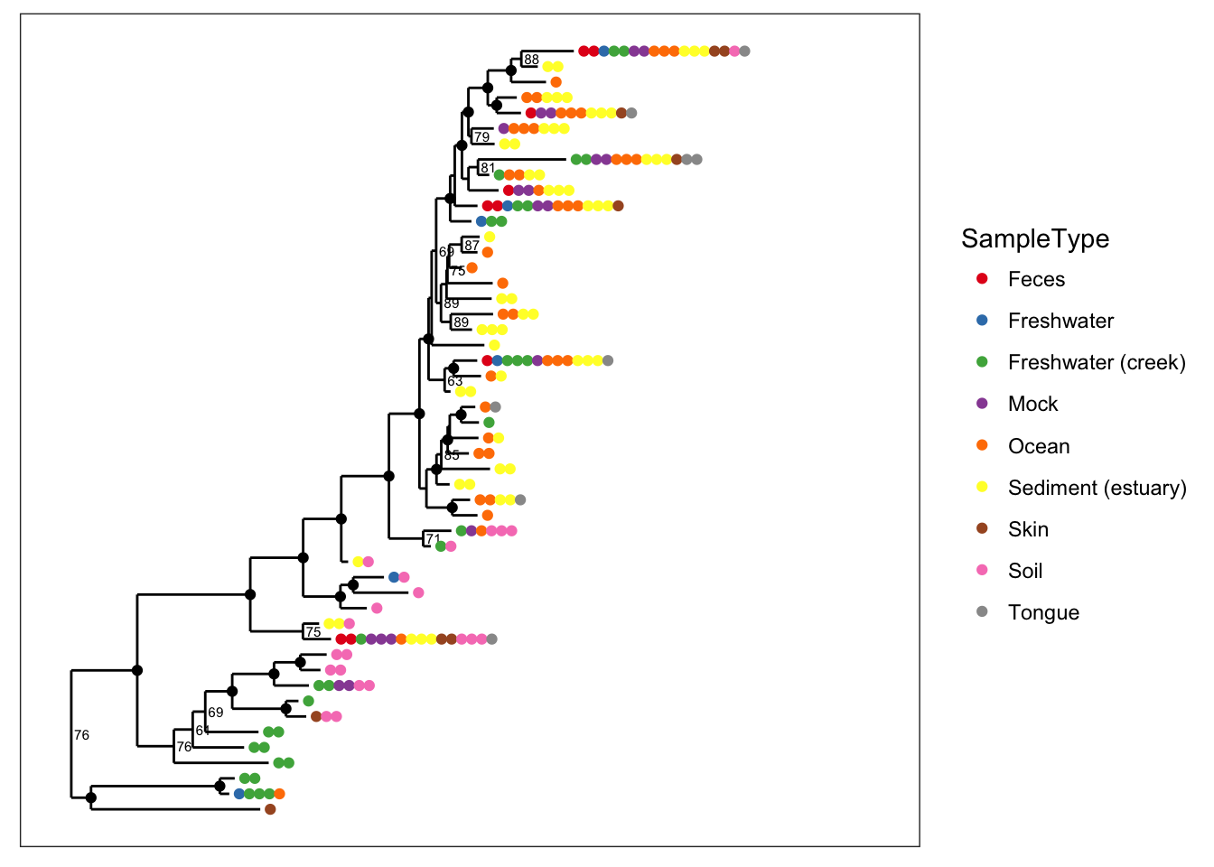
# Special bootstrap label with alternative thresholds
plot_tree(physeq, nodelabf=nodeplotboot(80,0,3), color="SampleType", ladderize="left")
Tip labels
- label.tips - The
label.tipsparameter controls labeling of tree tips (AKA leaves). Default is NULL, indicating that no tip labels will be printed. If"taxa_names"is a special argument resulting in the OTU name (trytaxa_namesfunction) being labelled next to the leaves or next to the set of points that label the leaves. Alternatively, if your data object contains atax_table, then one of the rank names (fromrank_names(physeq)) can be provided, and the classification of each OTU at that rank will be labeled instead. - text.size - A positive numeric argument indicating the ggplot2 size parameter for the taxa labels. Default is
NULL. If left asNULL, this function will automatically calculate a (hopefully) optimal text size given the size constraints posed by the tree itself (for a vertical tree). This argument is included mainly in case the automatically-calculated size is wrong and you want to change it. Note that this parameter is only meaningful iflabel.tipsis notNULL
plot_tree(physeq, nodelabf=nodeplotboot(80,0,3), color="SampleType", label.tips="taxa_names", ladderize="left")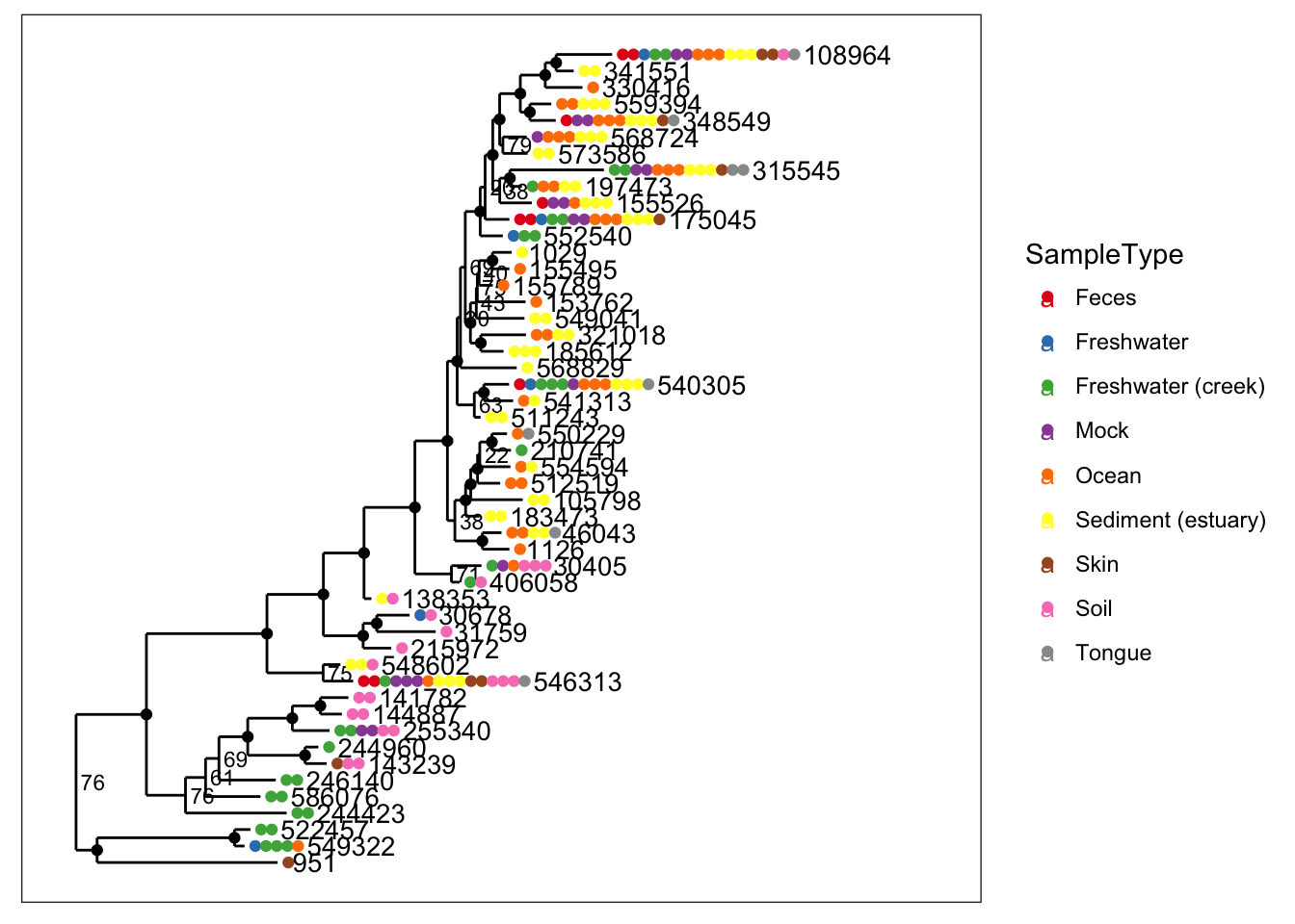
Radial Tree
Making a radial tree is easy with ggplot2, simply recognizing that our vertically-oriented tree is a cartesian mapping of the data to a graphic – and that a radial tree is the same mapping, but with polar coordinates instead.
data(esophagus)
plot_tree(esophagus, color="Sample", ladderize="left") + coord_polar(theta="y")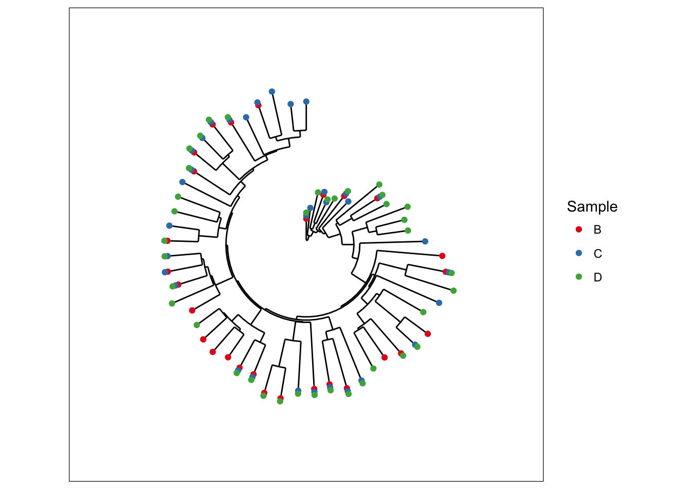
The GlobalPatterns dataset has additional data we can map, so we will re-do some preliminary data loading/trimming to make this radial-tree example self contained, and then show the same plot as above.
plot_tree(physeq, nodelabf=nodeplotboot(60,60,3), color="SampleType", shape="Class", ladderize="left") + coord_polar(theta="y")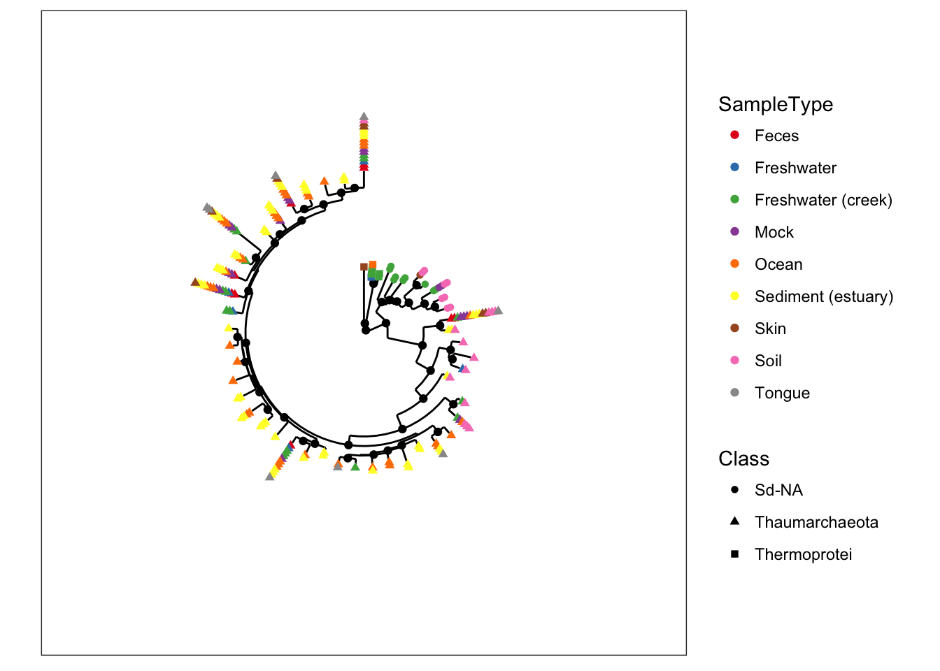
The esophagus dataset.
A simple dataset containing tree and OTU-table components.
The esophagus is a small and relatively simple dataset by moderns standards. It only contains 3 samples, no sample-data, and a modest quantity of total sequencing per sample that is a relic of an earlier time when resources for this sort of investigation were sparse and sequencing was expensive. Nevertheless, it makes for a nice sized dataset to start displaying trees. (For more details about the dataset and its origin, try entering ?esophagus into the command-line once you have loaded the phyloseq package)
The default tree without any additional parameters is plot with black points that indicate in how many different samples each OTU was found. In this case, the term “OTU” is used quite loosely (it is a loose term, after all) to mean entries in the taxononmic data you are plotting; and in the specific case of trees, it means the tips, even if you have already agglomerated the data such that each tip is equivalent to a rank of class or phylum.
plot_tree(esophagus, title="Default tree.")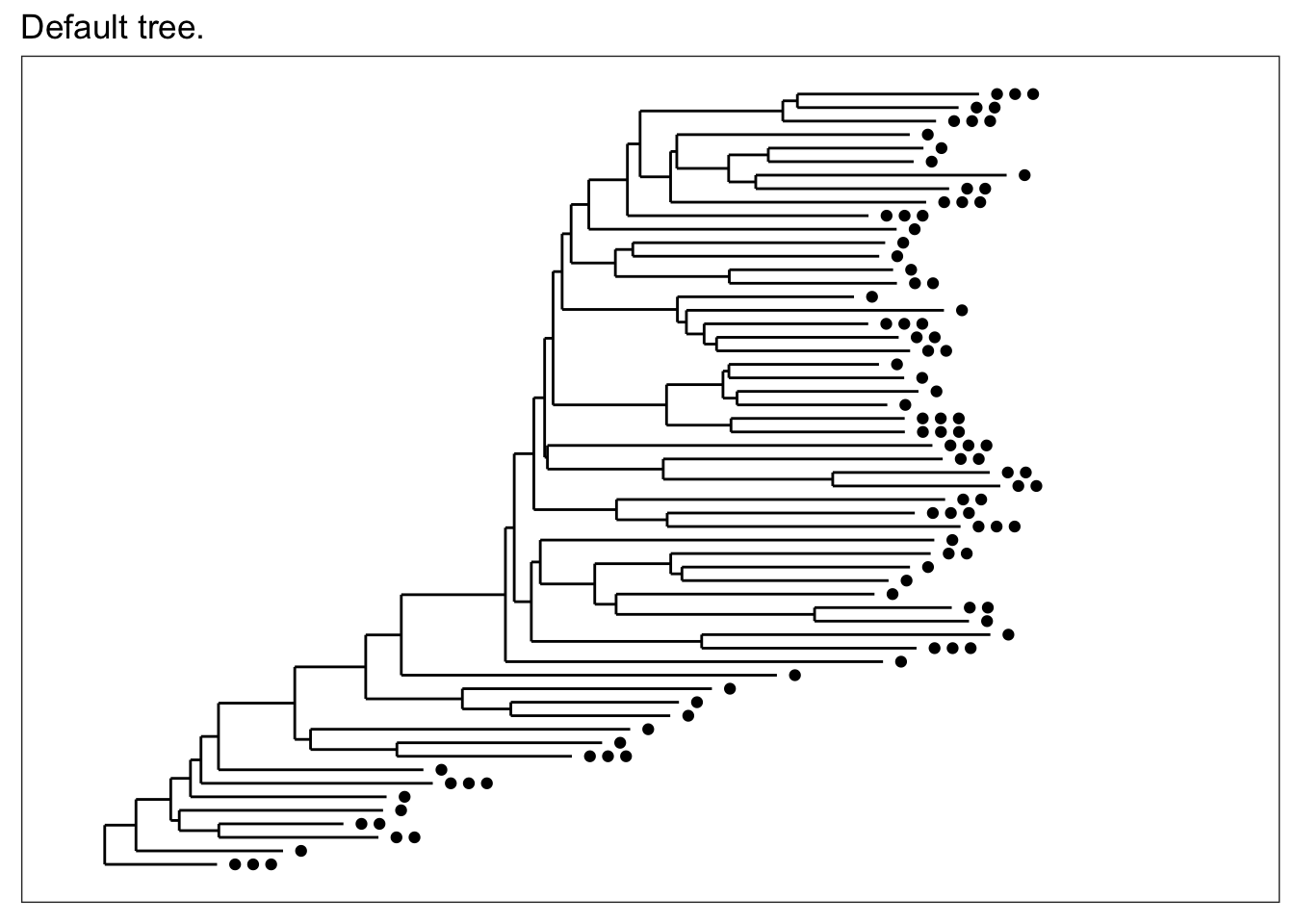
If for some reason you just want an unadorned tree, the "treeonly" method can be selected. This tends to plot much faster than the annotated tree, and is still a ggplot2 object that you might be able to add further layers to manually.
plot_tree(esophagus, "treeonly", title="method = \"treeonly\"")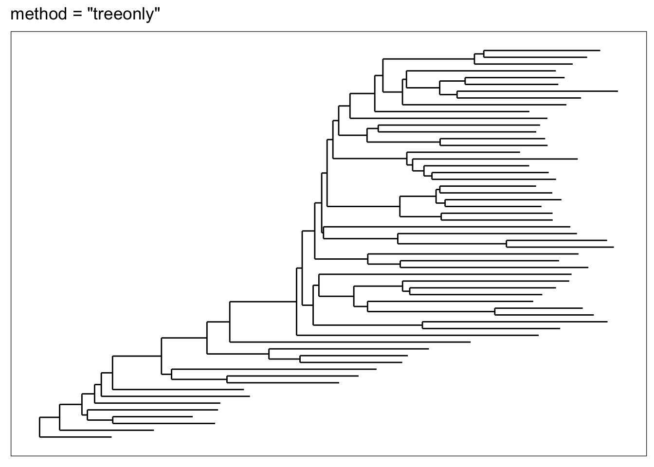
Now let’s shade tips according to the sample in which a particular OTU was observed.
plot_tree(esophagus, color="samples")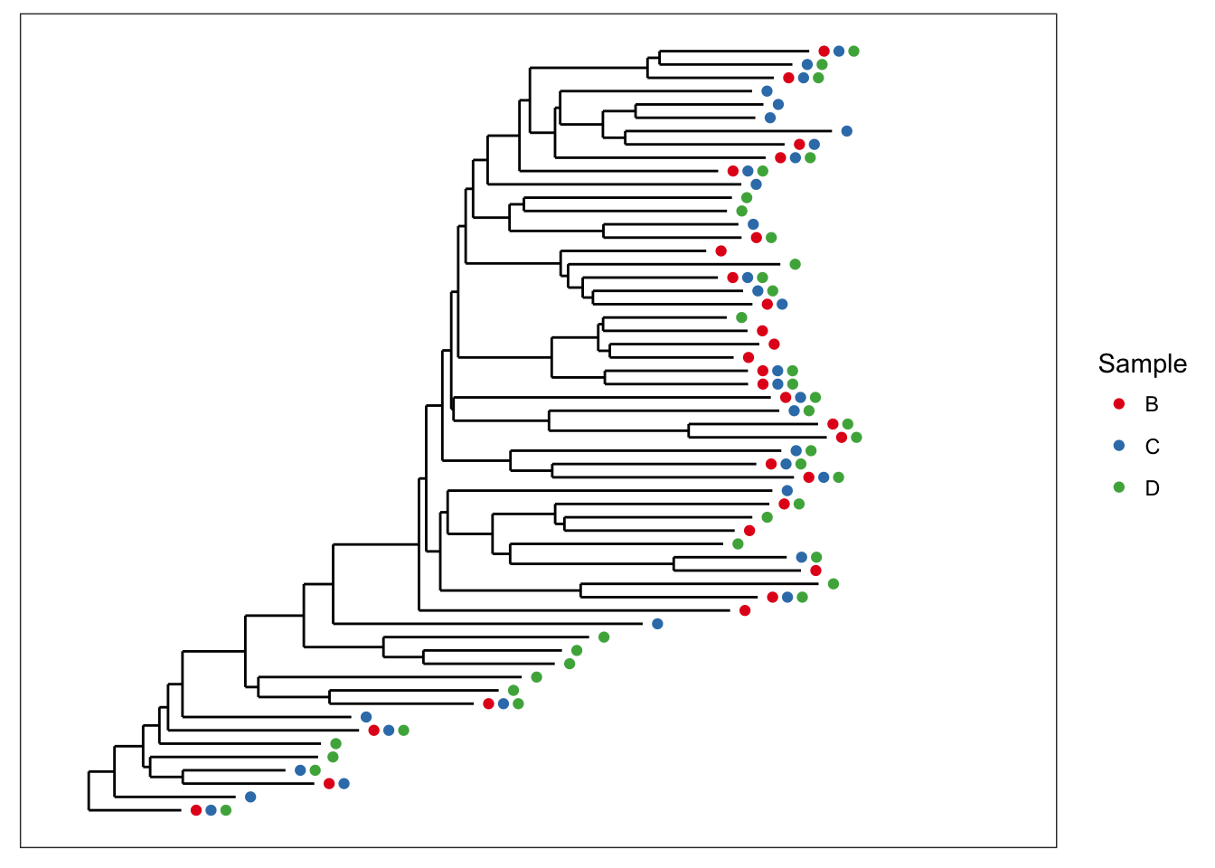
We can also scale the size of tips according to abundance; usually related to number of sequencing reads, but depends on what you have done with the data prior to this step.
plot_tree(esophagus, size="abundance")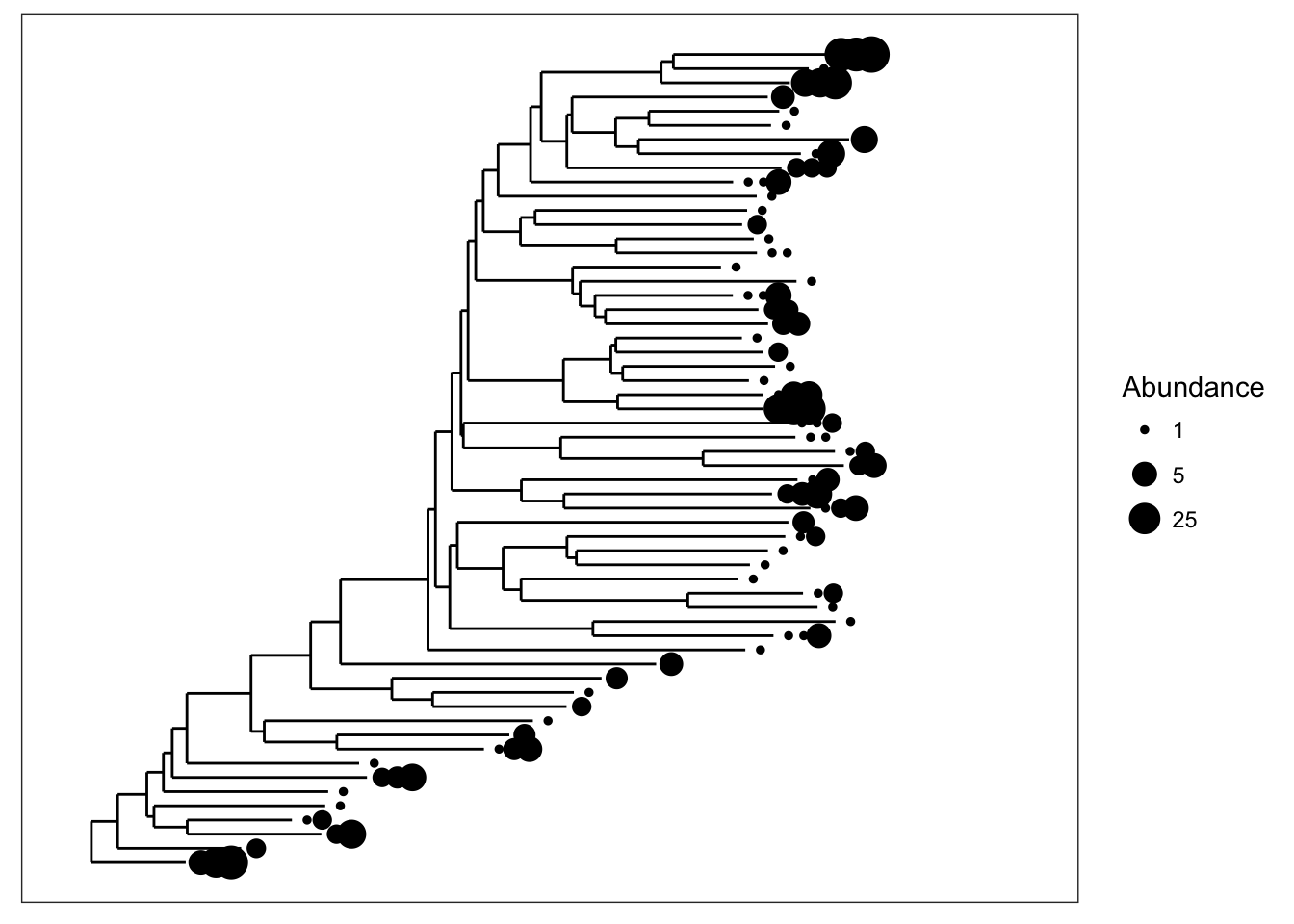
Both graphical features included at once.
plot_tree(esophagus, size="abundance", color="samples")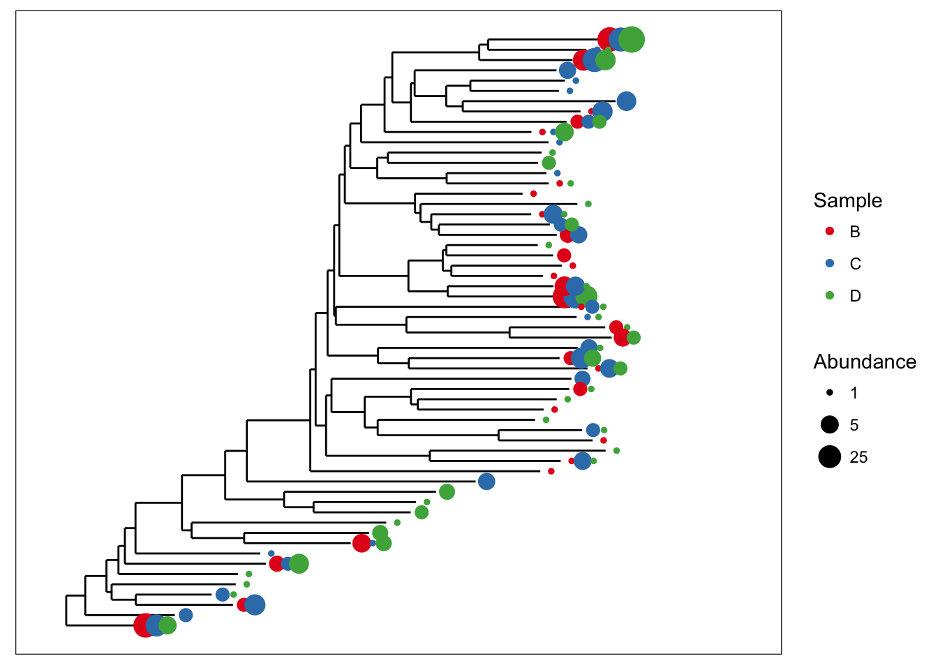
There is some overlap of the tip points. Let’s adjust the base spacing to spread them out a little bit.
plot_tree(esophagus, size="abundance", color="samples", base.spacing=0.03)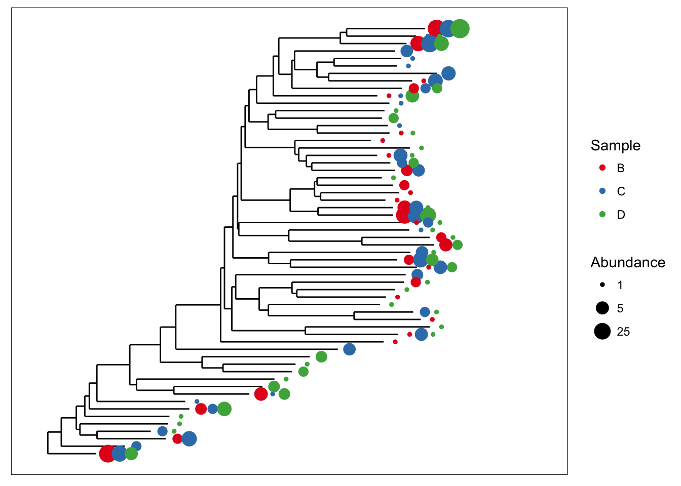
Good, now what if we wanted to also display the specific numeric value of OTU abundances that occurred more than 3 times in a given sample? For that, plot_tree includes the min.abundance parameter, set to Inf by default to prevent any point labels from being written.
plot_tree(esophagus, size="abundance", color="samples", base.spacing=0.03, min.abundance=3)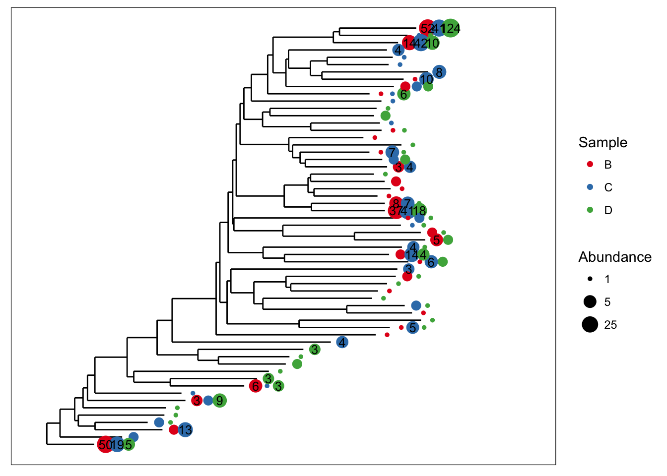
More Examples with the Global Patterns dataset
Subset Global Patterns dataset to just the observed Archaea.
gpa <- subset_taxa(GlobalPatterns, Kingdom=="Archaea")The number of different Archaeal taxa from this dataset is small enough for a decent tree plot.
ntaxa(gpa)## [1] 208That is to say, it is reasonable to consider displaying the phylogenetic tree directly for gpa. Too many OTUs means a tree that is pointless to attempt to display in its entirety in one graphic of a standard size and font. So the whole GlobalPatterns dataset probably a bad idea.
ntaxa(GlobalPatterns)## [1] 19216Some patterns are immediately discernable with minimal parameter choices:
plot_tree(gpa, color="SampleType")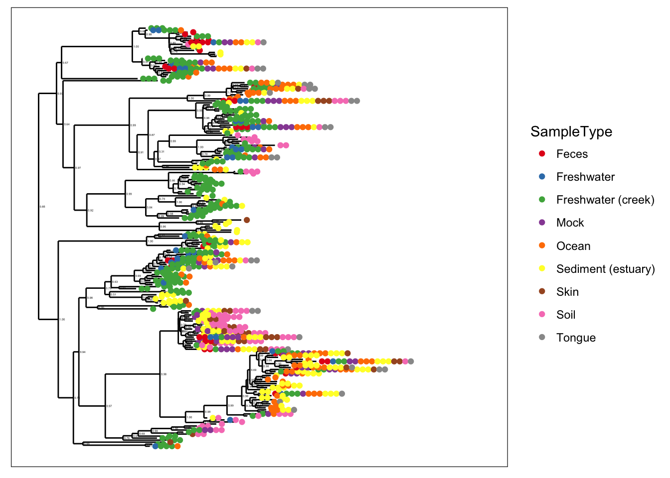
plot_tree(gpa, color="Phylum")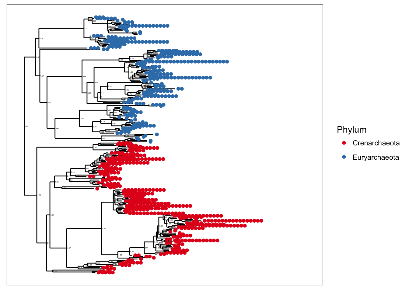
plot_tree(gpa, color="SampleType", shape="Phylum")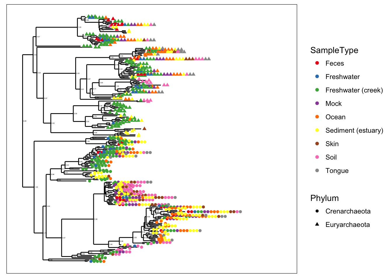
plot_tree(gpa, color="Phylum", label.tips="Genus")
However, the text-label size scales with number of taxa, and with common graphics-divice sizes/resolutions, these ~200 taxa still make for a somewhat crowded graphic.
Let’s instead subset further to just the Crenarchaeota
gpac <- subset_taxa(gpa, Phylum=="Crenarchaeota")
plot_tree(gpac, color="SampleType", shape="Genus")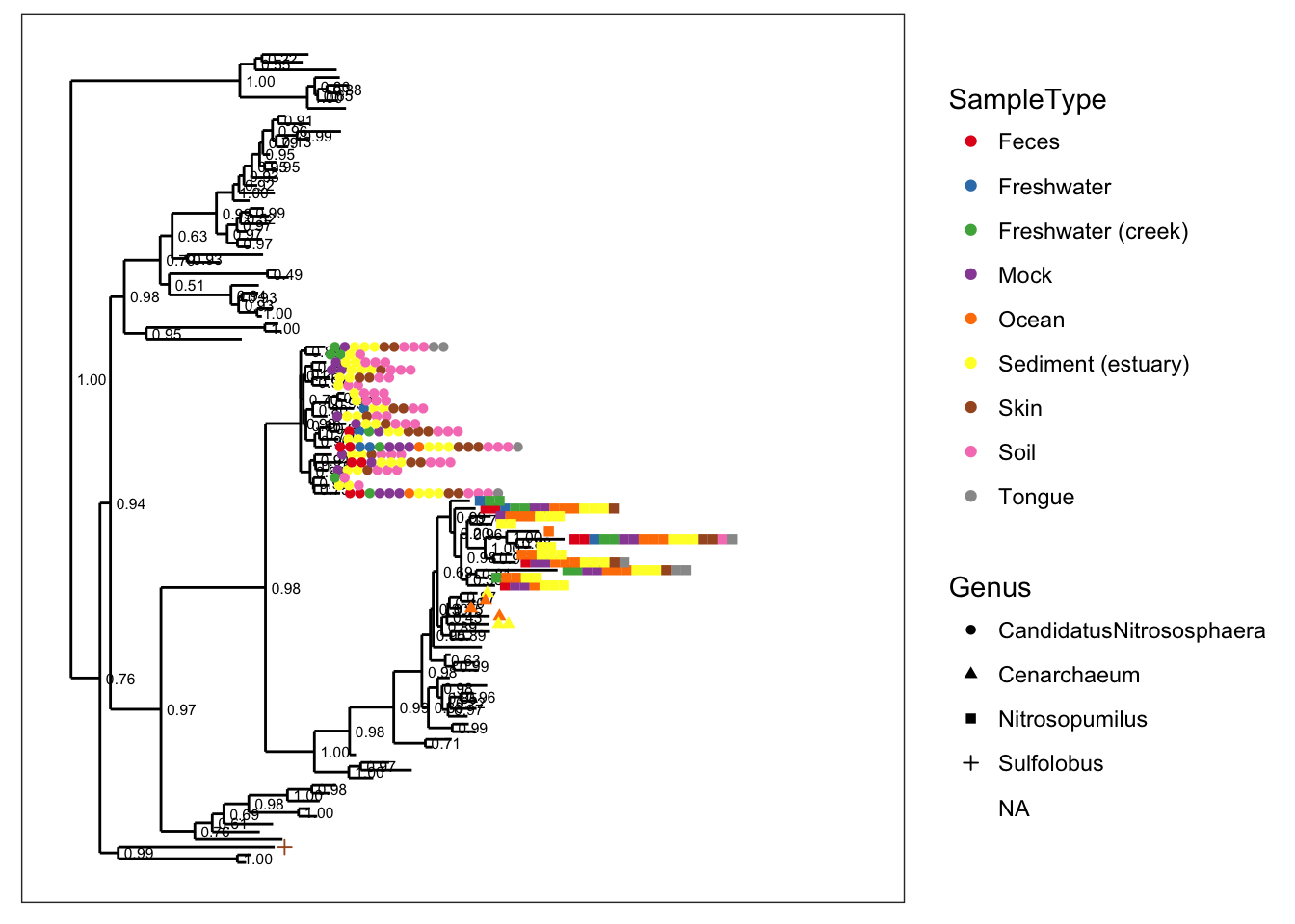
plot_tree(gpac, color="SampleType", label.tips="Genus")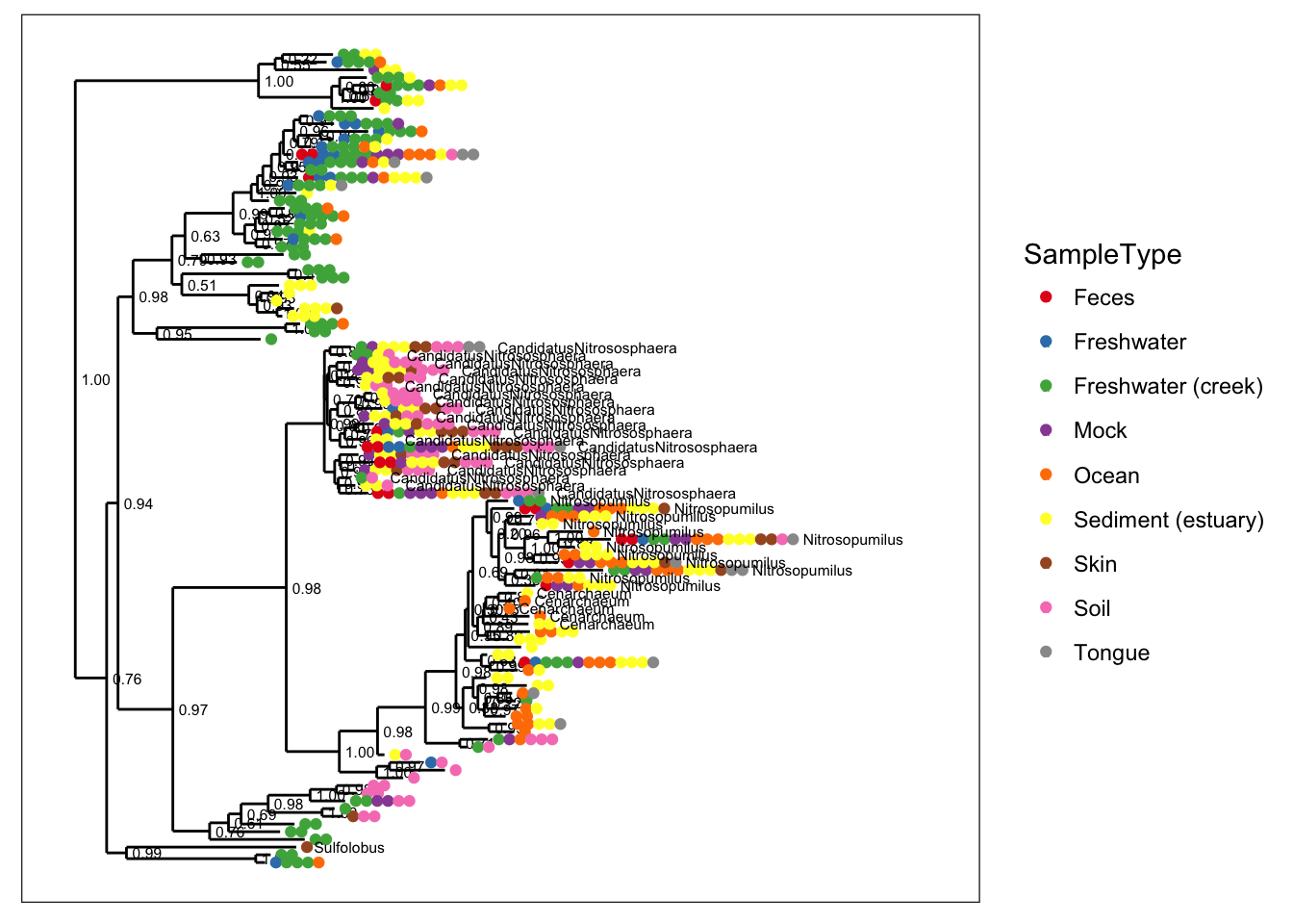
Let’s add some abundance information. Notice that the default spacing gets a little crowded when we map taxa-abundance to point-size:
plot_tree(gpac, color="SampleType", shape="Genus", size="abundance", plot.margin=0.4)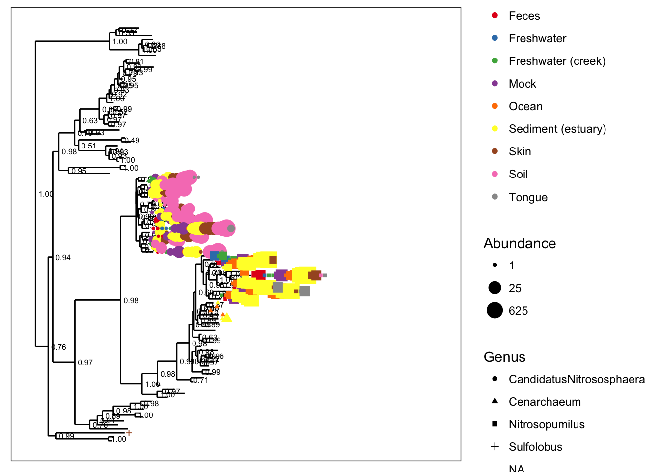
So let’s spread it out a little bit with the base.spacing parameter, and while we’re at it, let’s call off the node labels…
plot_tree(gpac, nodelabf=nodeplotblank, color="SampleType", shape="Genus", size="abundance", base.spacing=0.04, plot.margin=0.4)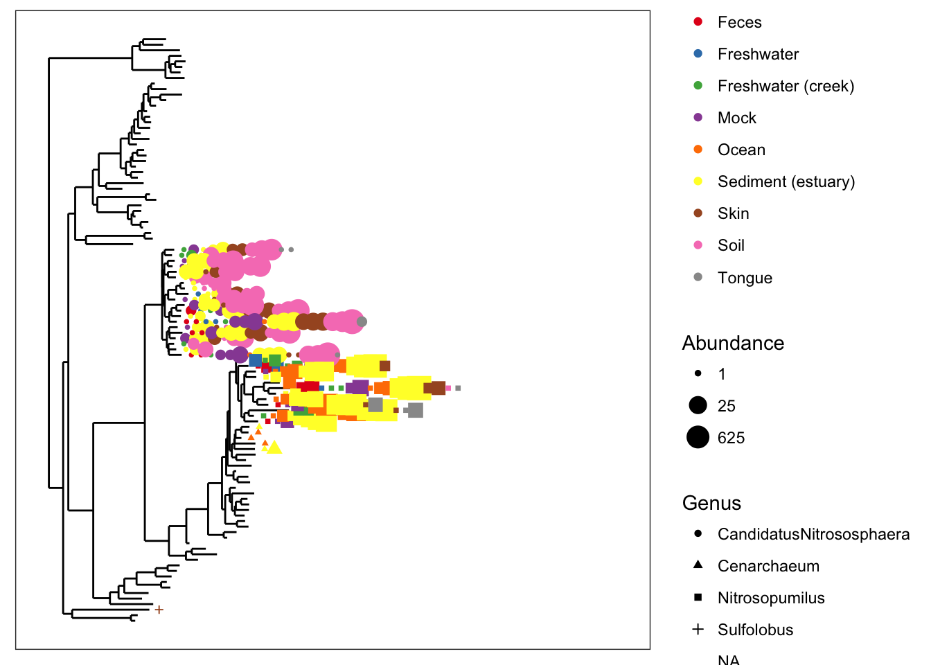
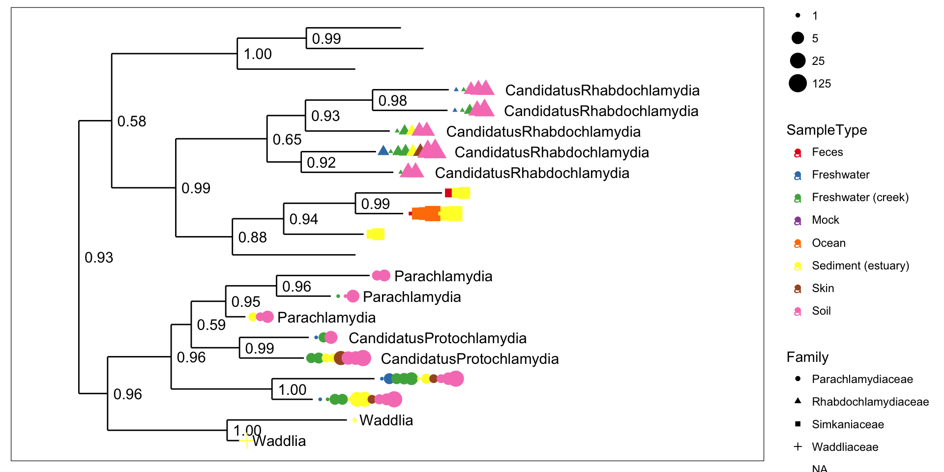
Chlamydiae-only tree
GP.chl <- subset_taxa(GlobalPatterns, Phylum=="Chlamydiae")
plot_tree(GP.chl, color="SampleType", shape="Family", label.tips="Genus", size="abundance", plot.margin=0.6)